Amberwood: From Wordmark To Typeface
Amberwood began as a concept for a brewery logo. From 2016 to 2023 the letters continued to evolve, and after a number of false starts have finally become the typeface they were always destined to be.
In 2016, I was hired to make a logo for a start-up brewery called Amber Wood Brewing. The concept for the brewery was “a modern take on uncommon German recipes,” which I expressed by combining blackletter characteristics on a sans serif base. Amberwood also needed to evoke imagery of being in a dense wood so I devised a set of “rules” that then became the base concept for the typeface drawings.
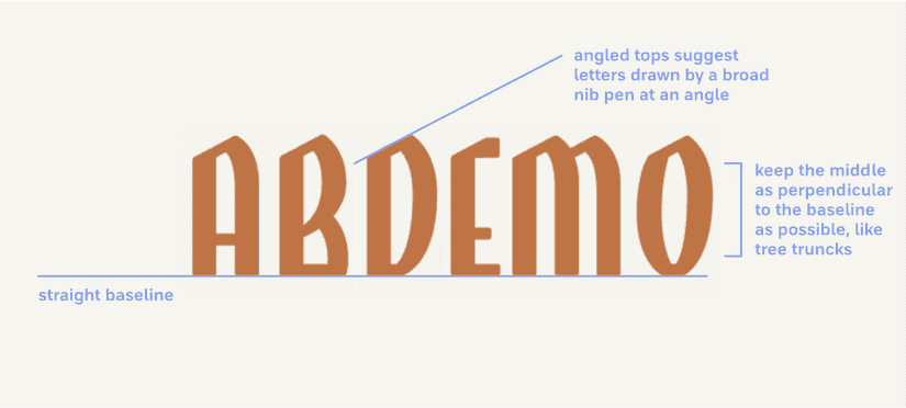
The brewery was eventually renamed Sundown Brewing before launching so the Amberwood wordmark never saw the light of day. I tucked the idea into the back of my hard drive and waited.
Public Type Works
Three years later in 2019, I was invited to participate in the inaugural run of Public Type Works. The idea was to create a rough draft of a font and gather backers who would fund the project (like Kickstarter) and if successful the font would have been available open source at the end of the project.
I chose Amberwood and built out the remaining letters in a quick draft. It was far enough along to make some quick graphics to garner interest but still had a long way to go before becoming a cohesive font.
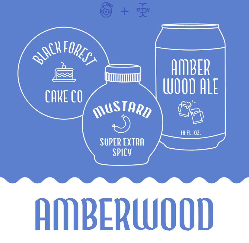
It was a fun experiment but unfortunately, there was not enough interest in funding open-source fonts and I set Amberwood aside for a second time.
The Final Push
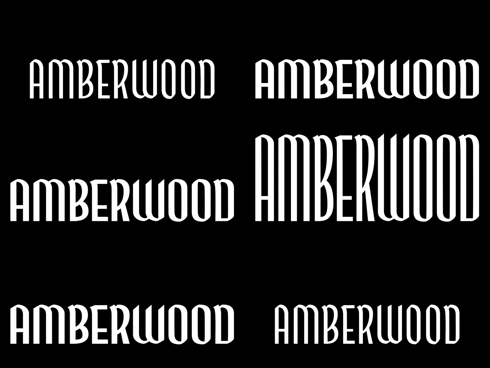
The graphics I made to promote Amberwood on Public Type Works included a tease of a possible height axis which was debated three years later in a Twitter thread about whether a height axis should be included in a font. A screenshot of Amberwood was posted in the thread and caught the attention of a book designer who thought it would be perfect for an upcoming series of fantasy novels.
This was the final push I needed to dust off Amberwood for a third time and get those letterforms sorted out! Working with publishing deadlines meant that I had only a month to finish Amberwood making this the quickest draft to final font file that I have ever done (even though the draft took 6 years to make 😂).
I did another study of blackletter with my parallel pen to make sure I was bringing in enough blackletter DNA to the project.
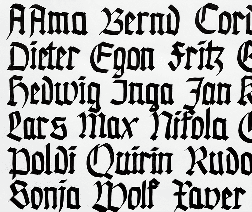
I discovered that in my Public Type Works draft, I had lost a little too much blackletter flavour (I’m very good at refining things too far). I revised my “rules” to include more character and consistency.
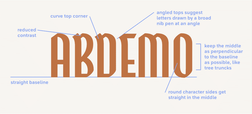
When Consistency Becomes The Enemy
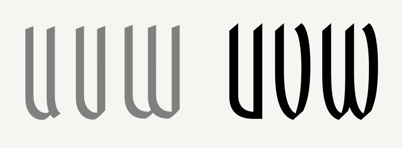
One of the things I struggled with until nearly finished was the W and V characters. It was a symptom of a wider problem that comes with a tall, condensed design containing a lot of straight sides – it can become difficult to differentiate each letter from another. Much of type design is creating unity with consistency but there is a point in which consistency turns on you and becomes the enemy. I had to come up with an entirely different pointed bottom shape for these two letters that ended up breaking some of my other rules but increased readability and lessened the confusion between the V and the U.
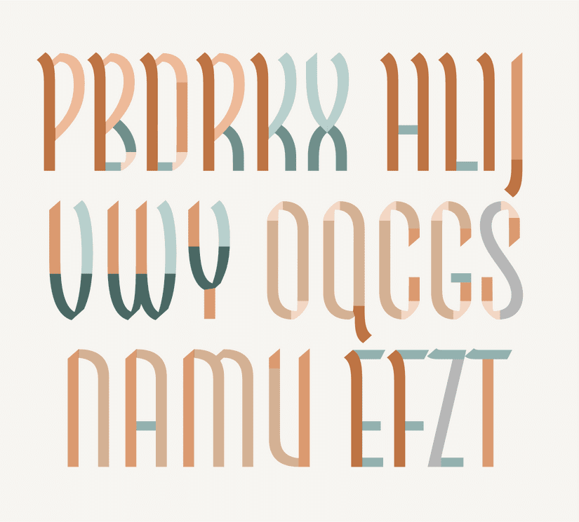
Even after introducing more differentiation between letters, the shapes in Amberwood remain very consistent and have a lot of repeating shapes throughout the design. The following is an example of which letters share their shape with other letters.
Amberwood strikes a nice balance between having a blackletter flavour while remaining quite legible compared to other blackletters. This makes it ideal for packaging, logos, book covers, and other display instances. I hope to see it out in your designs soon!