Headphones.com Logo And Custom Wordmark
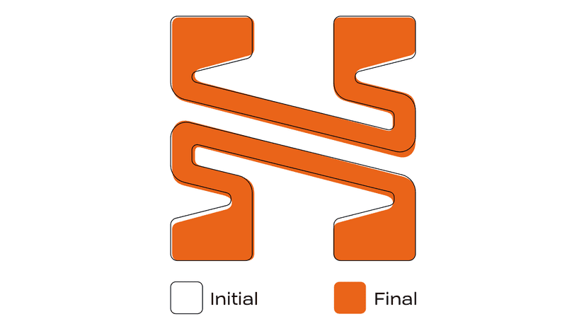
Headphones.com was looking to rebrand their online business. The designer came to me with a very cool new logo concept and “headphones.com” set in Name Sans. I was asked to refine the shape and unify the logo and wordmark.

The shape of the logo was very close and just needed some tuning around the curves and thicknesses of the diagonals.
When working on the wordmark, I rounded the corners and experimented with selective serifs. We didn’t want to overload the mark with too many serifs and make it feel crowded at small sizes. Because the idea was to emulate music notes we were able to put a serif-like shape on one end of a stem and keep it straight on the other.

