Doorstep Cannabis Custom Wordmark
This branding project was in collaboration with Humble Hound.
The aim of this rebrand was to elevate the brand into new markets of customers who were looking for a more upscale experience when ordering cannabis for at-home delivery.
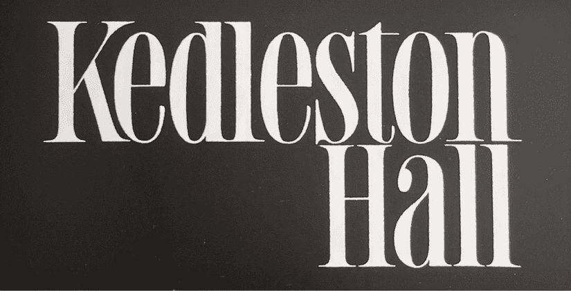
The wordmark took inspiration from a piece of lettering found in Rian Hughes’ Custom Lettering of the 60s &70s book. The piece attracted me because of the ridiculously high x-height and tall, condensed character that gave it a luxury brand feel without being too pretentious.
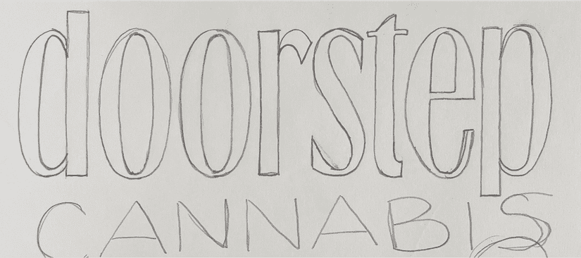
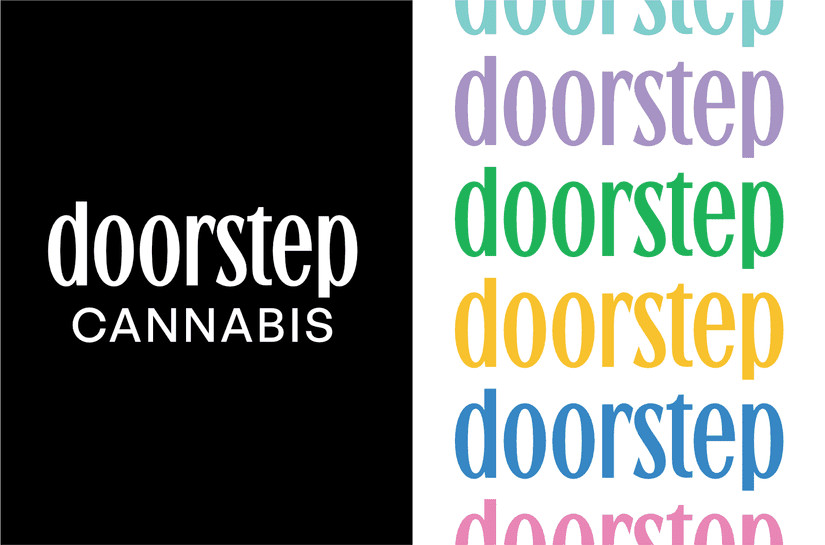
I started by lettering our word “doorstep” in the same style and then I removed the serifs to modernize the mark. The final step was to ensure it worked well at smaller sizes, which included elongating the ascenders and descenders, increasing the spacing, and reducing some contrast.
Because of budget restrictions we paired the custom wordmark with a free font, General Sans by Indian Type Foundry. General Sans complemented the wordmark well because it contrasted with the condensed nature, offering a wide, modern, open, and friendliness to the overall brand. It also contains a wide variety of styles ranging from Extra light to Bold which were needed for other graphics.


